RE Energy Drink
Personal Project
Objective
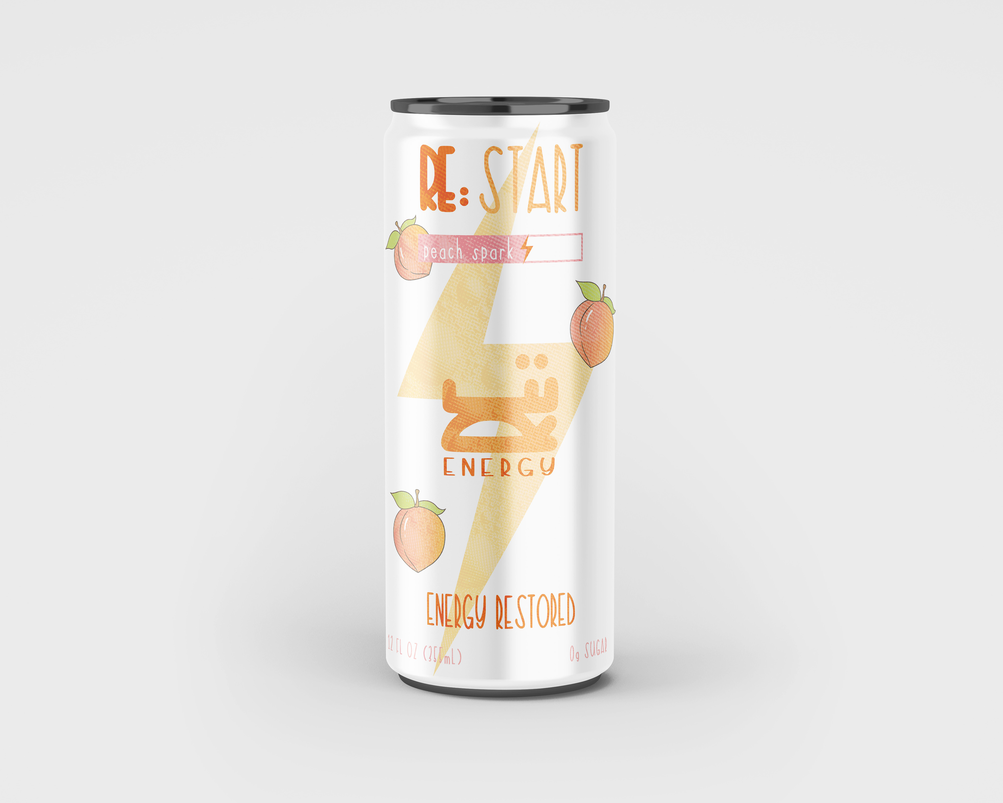
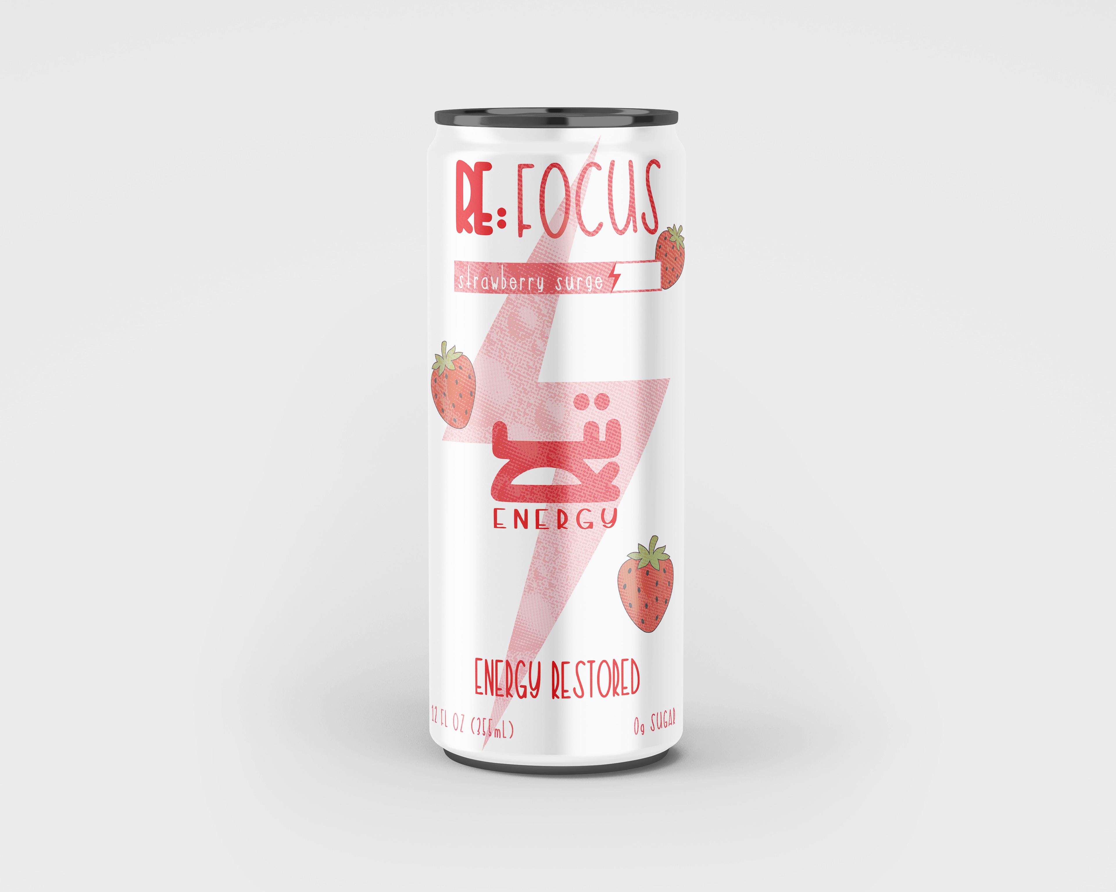
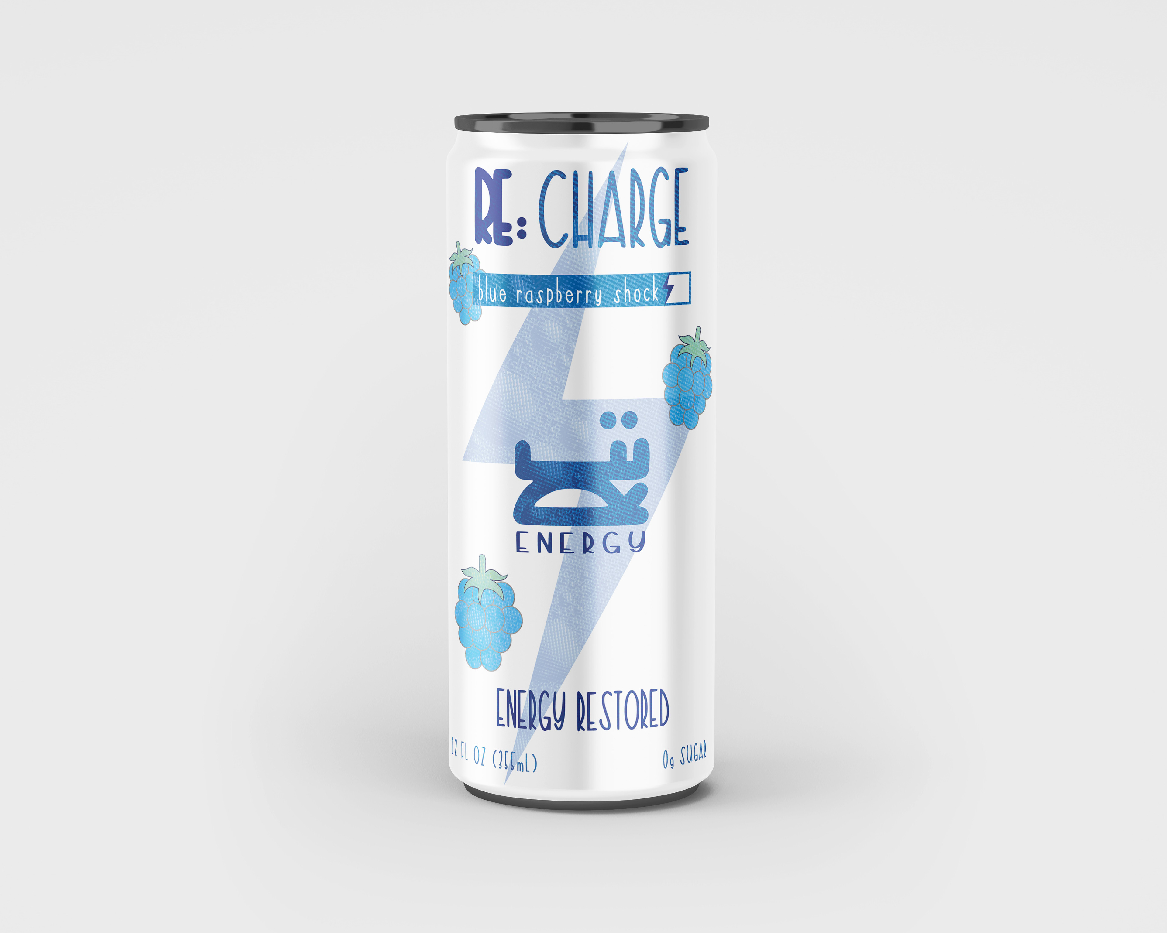
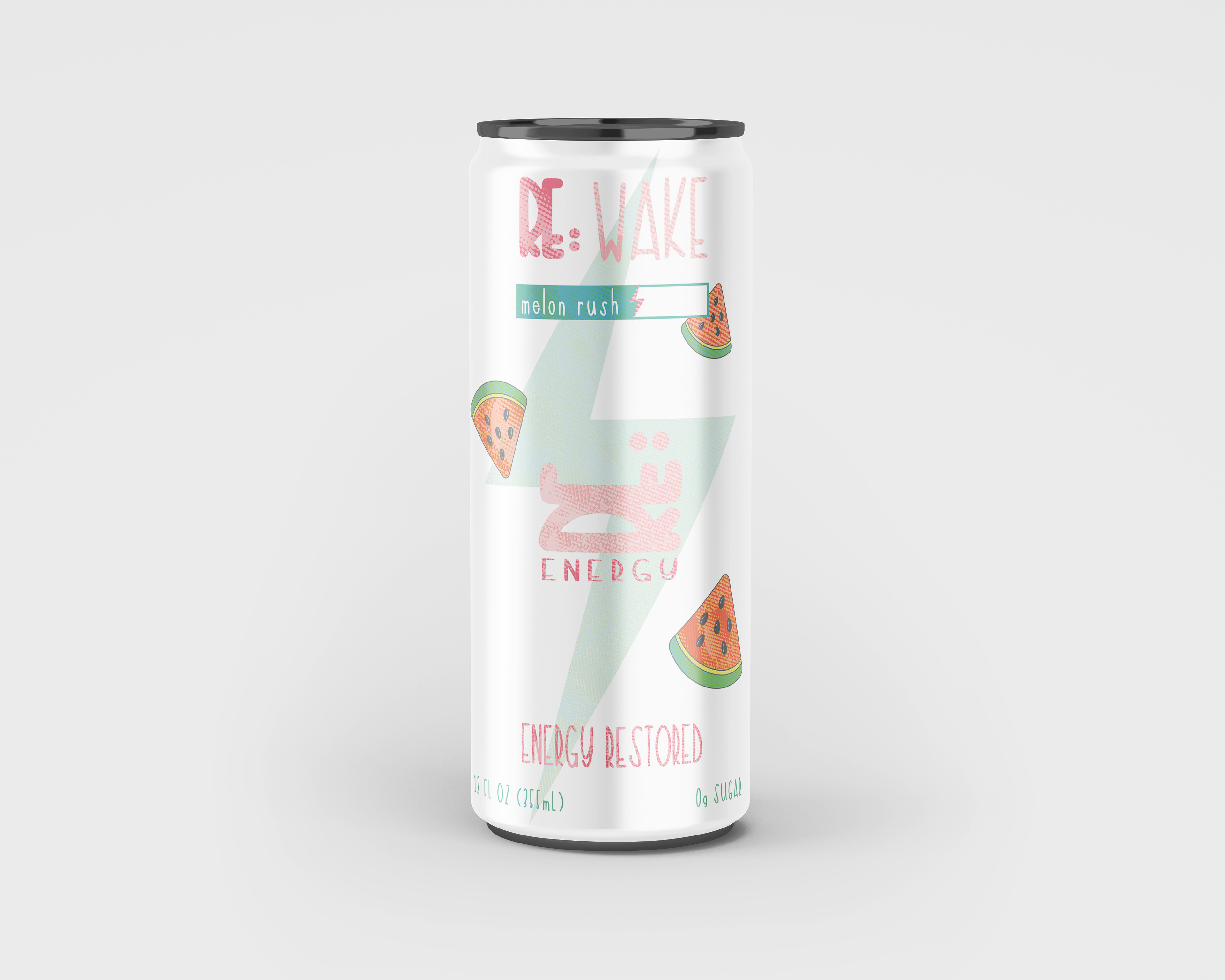
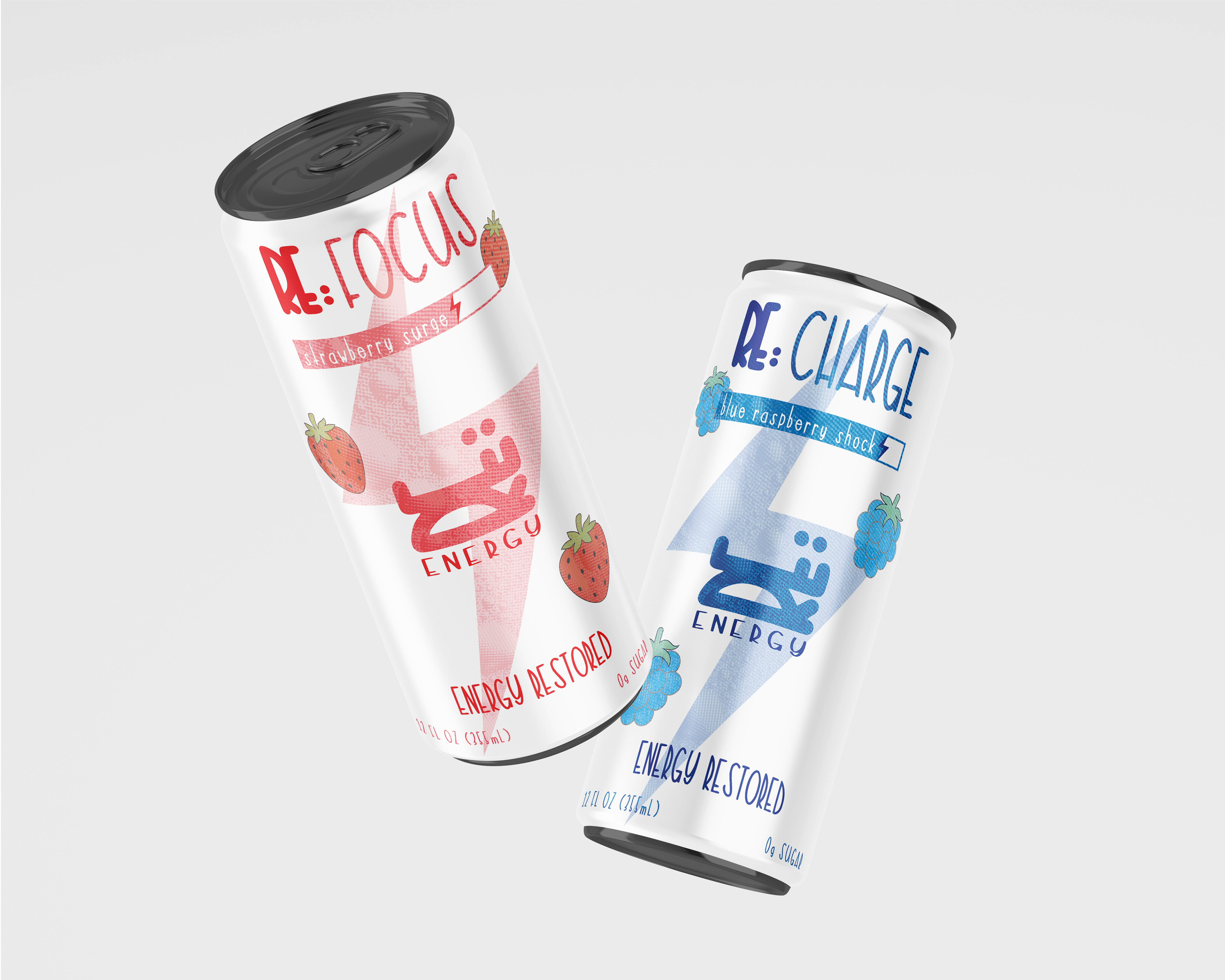
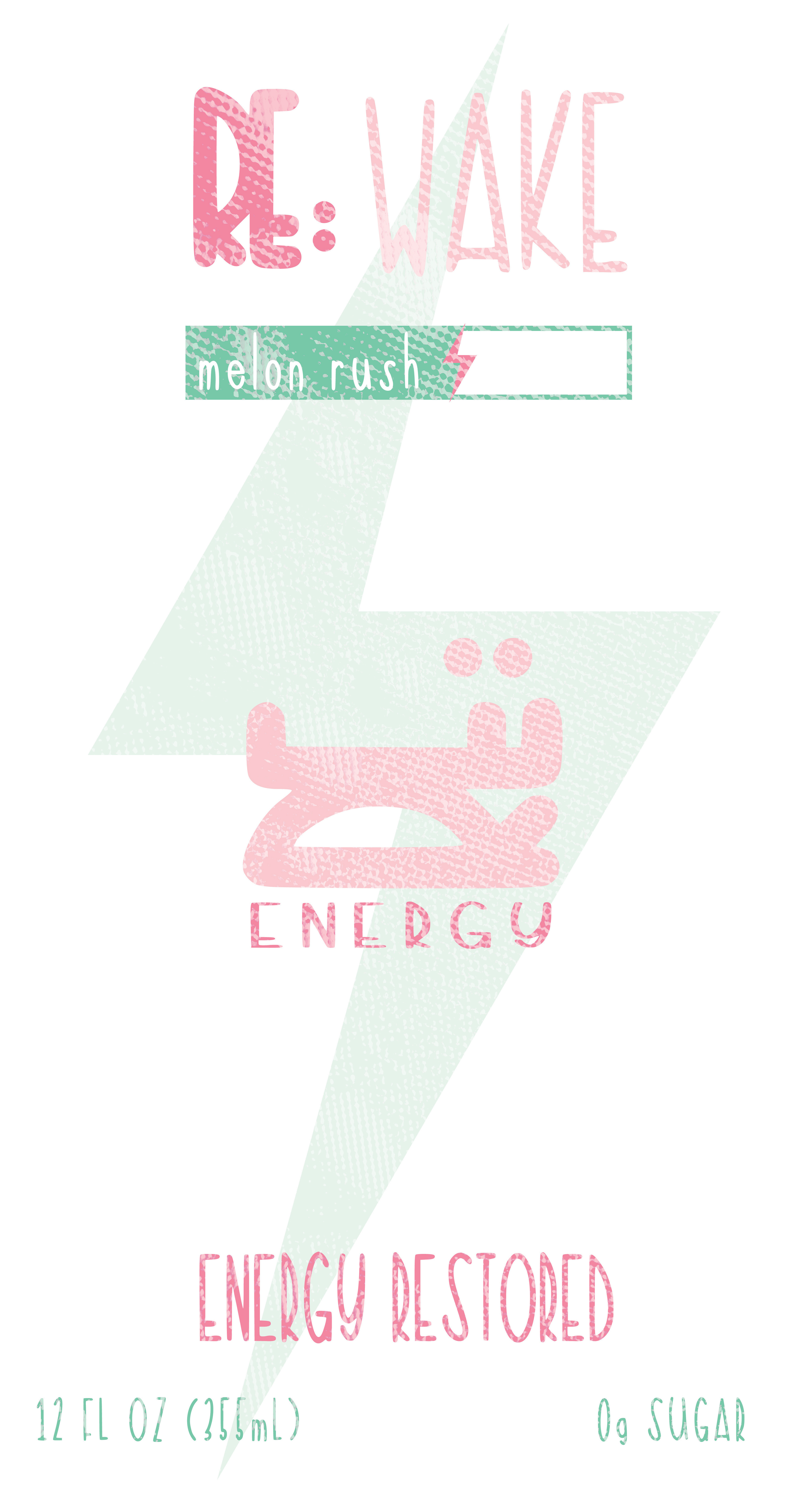
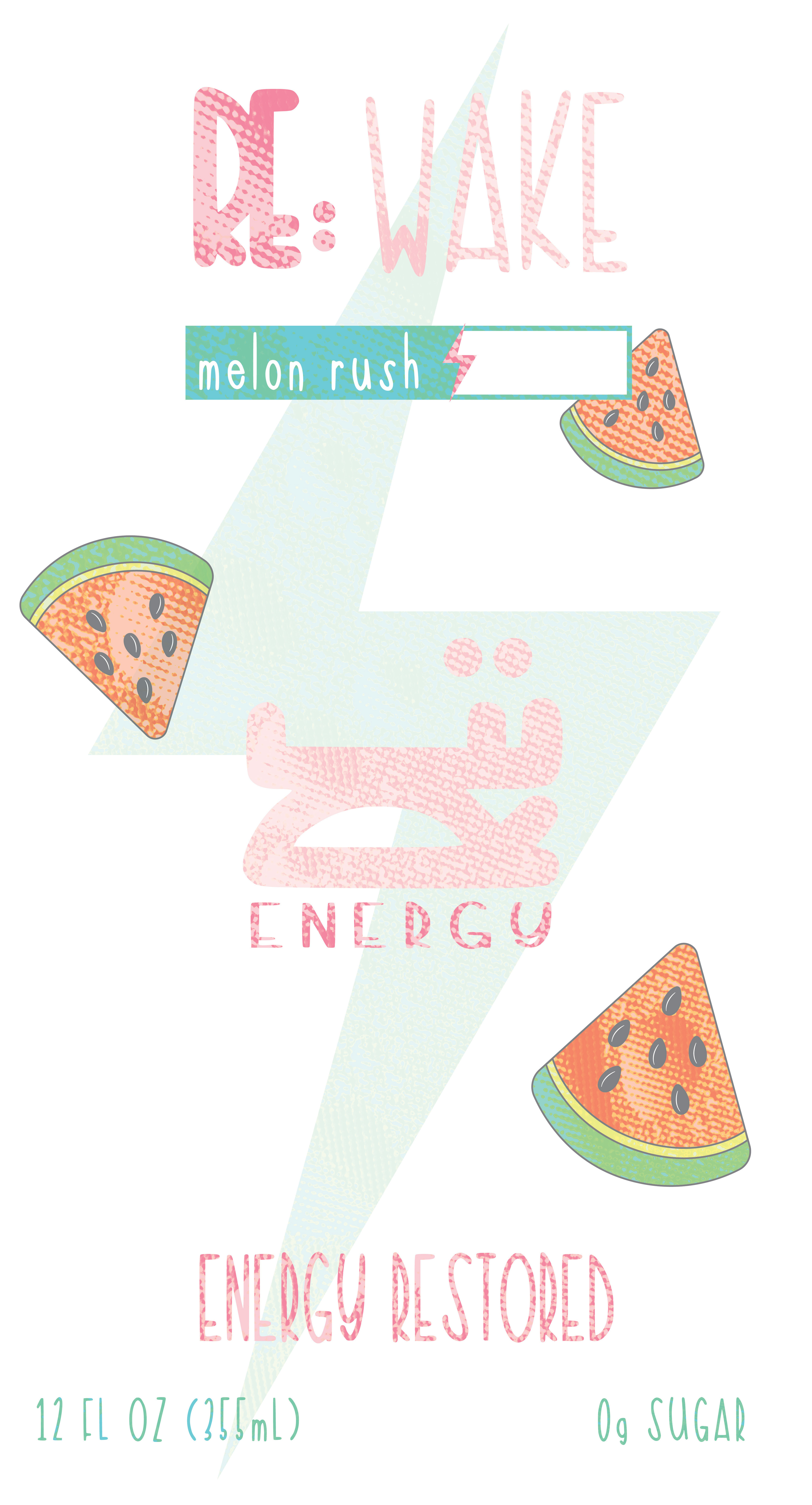
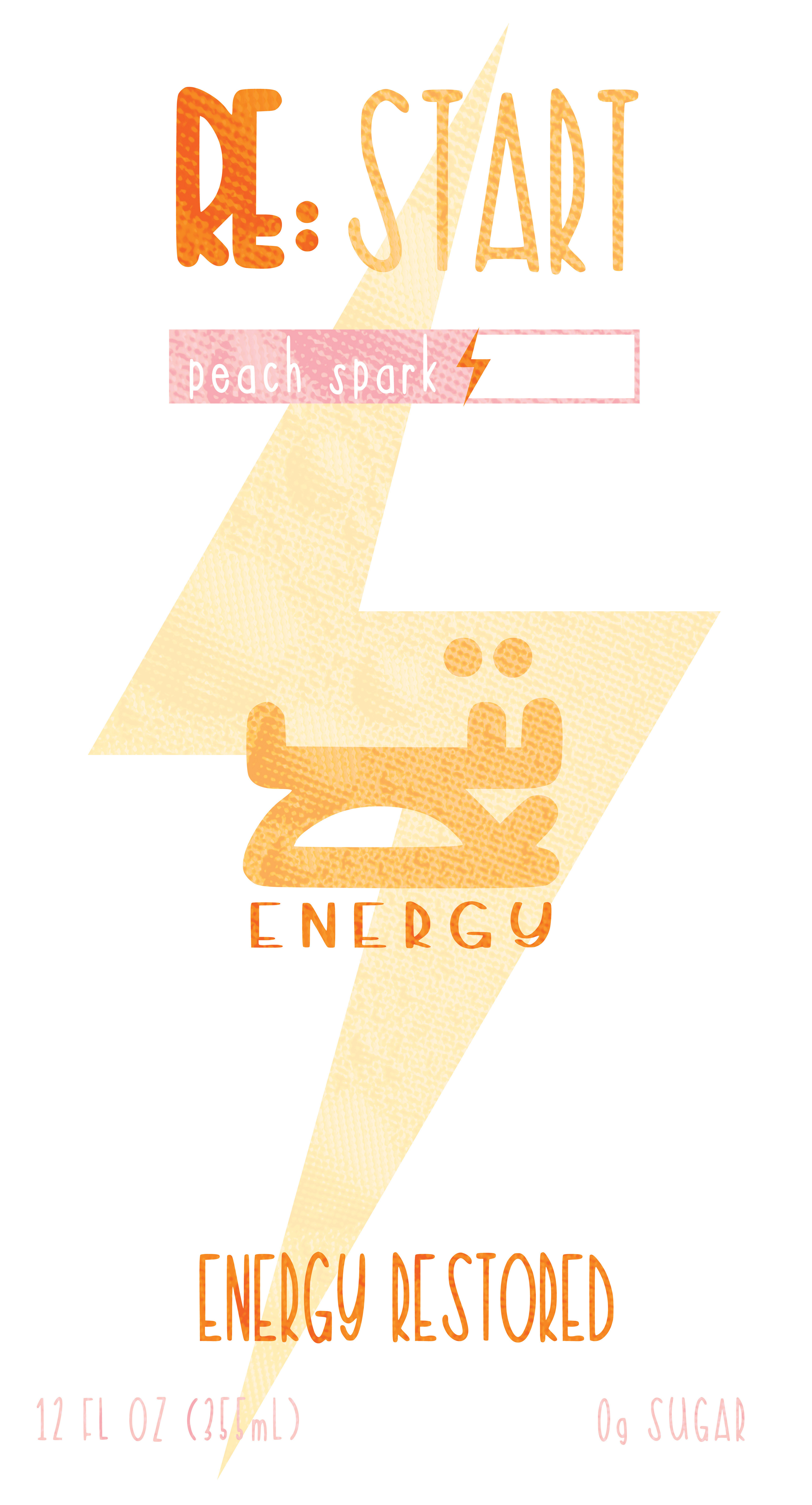
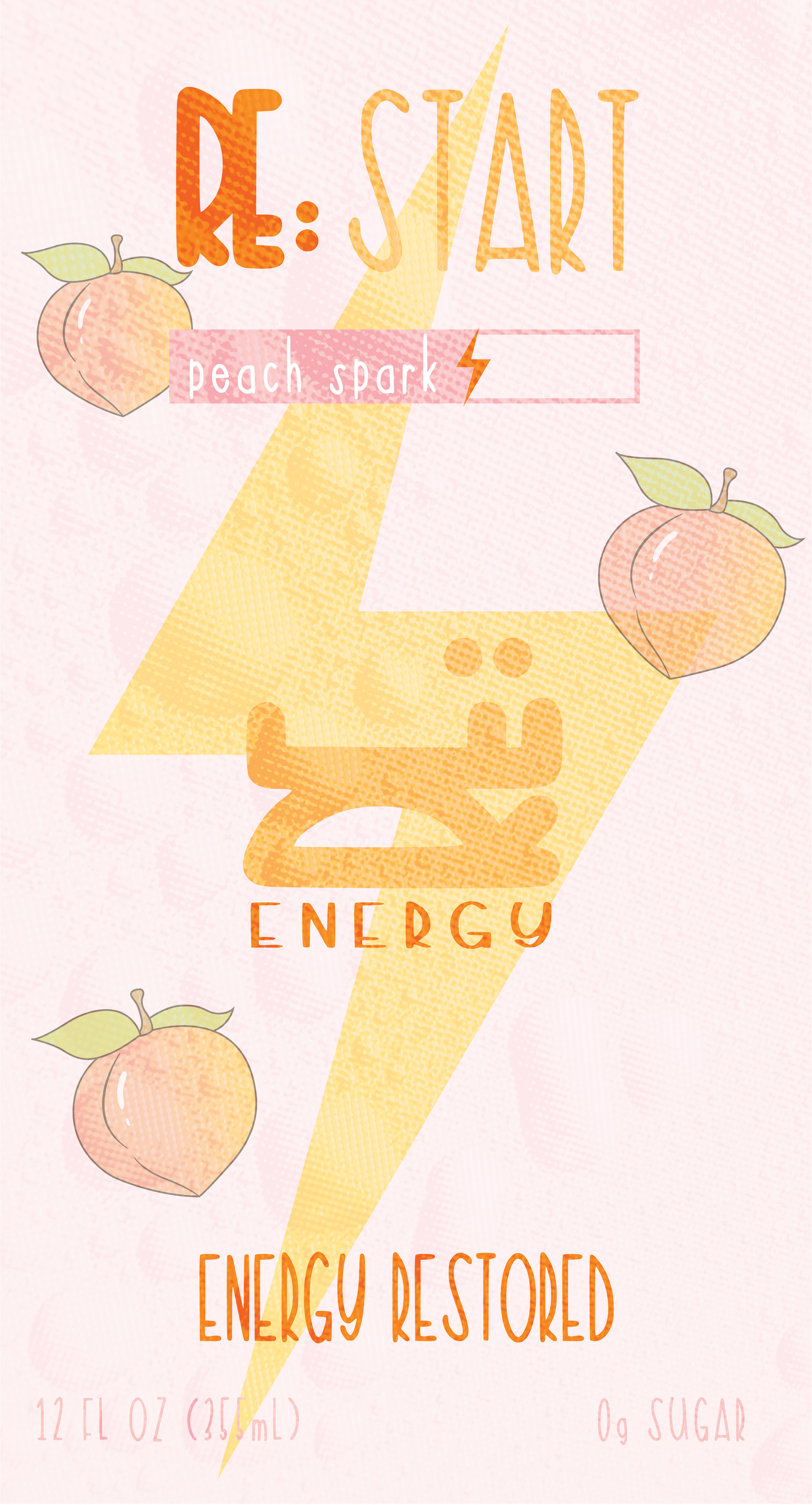
I wanted to create an energy drink brand that was completely my own and personal to me. My goal was to experiment with a unique typography, color, and packaging while creating something that feels fun, energetic, and different from typical energy drinks. Through RE, I wanted to explore how design can turn an everyday product into something people feel excited to pick up.
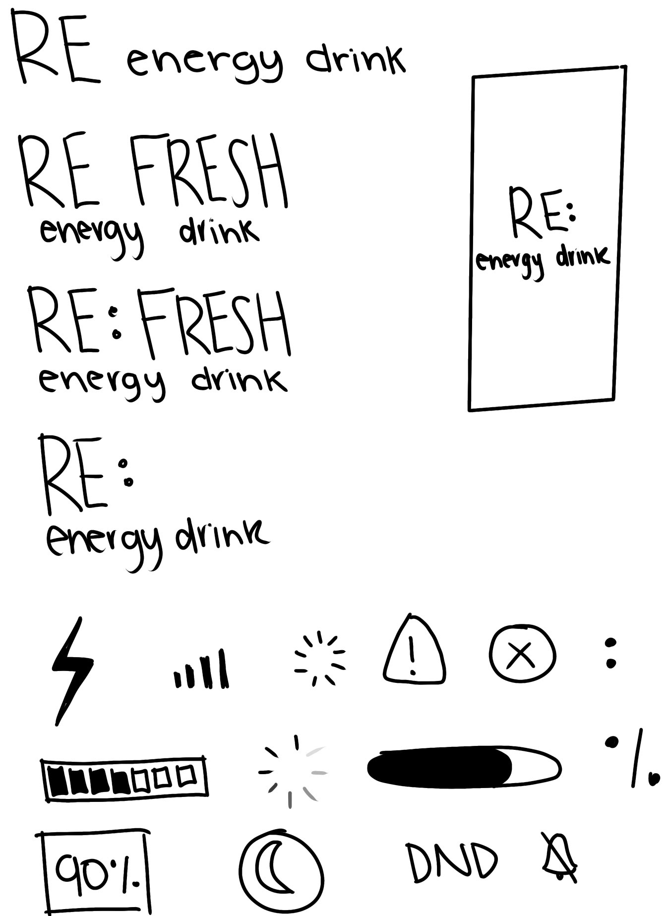
Sketches
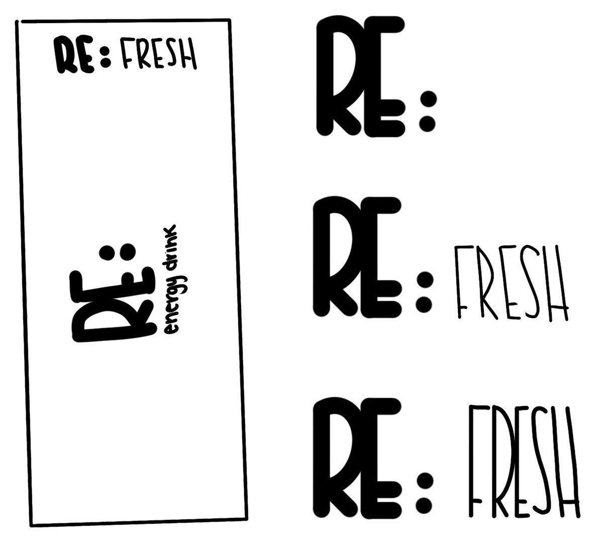
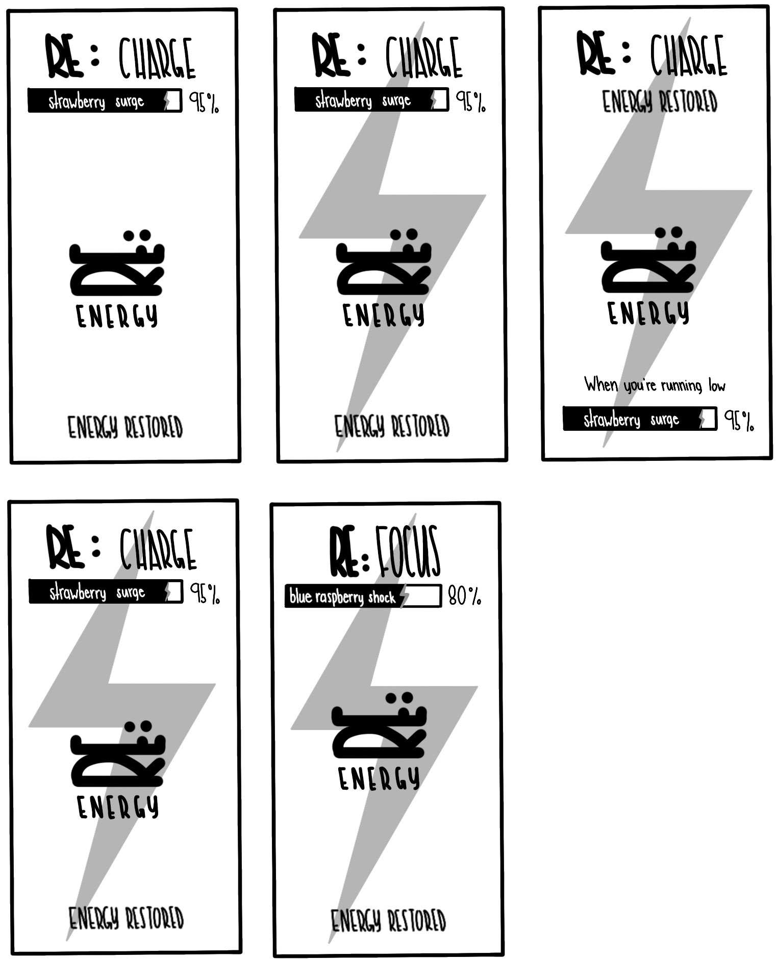
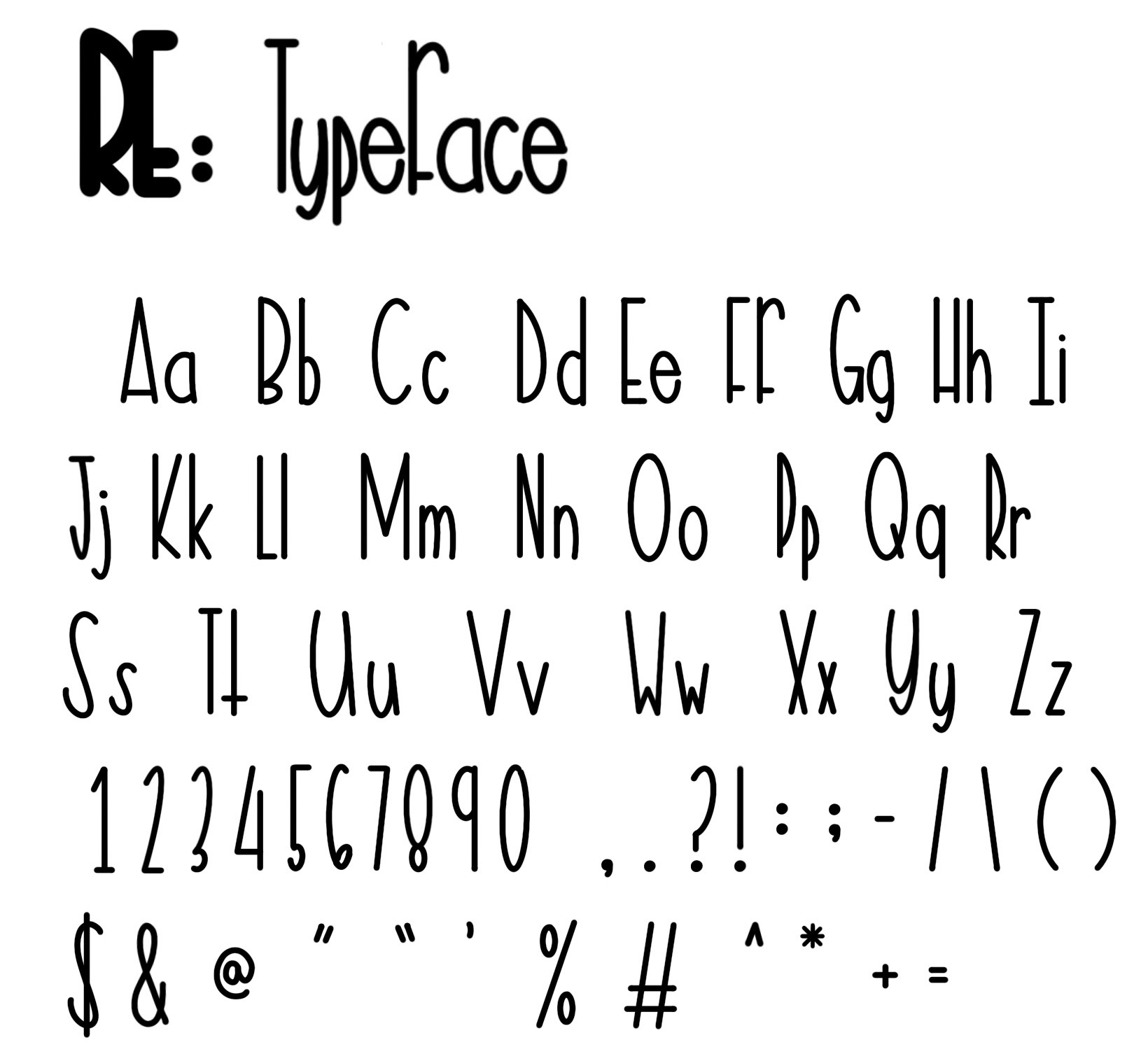
Typeface Studies
To make the RE brand feel more personal and recognizable, I created a custom typeface specifically for the identity. Designing my own typeface allowed me to create something unique to RE while helping the branding feel more cohesive across the packaging.
Process
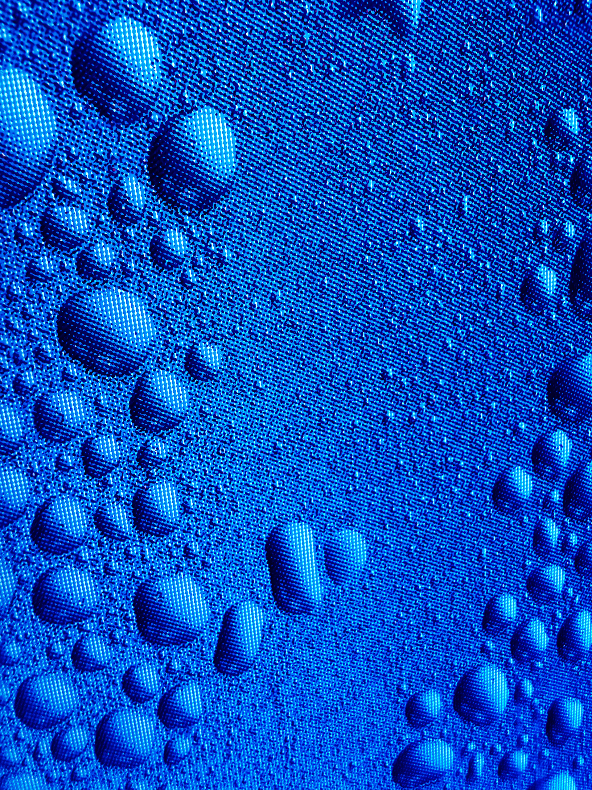
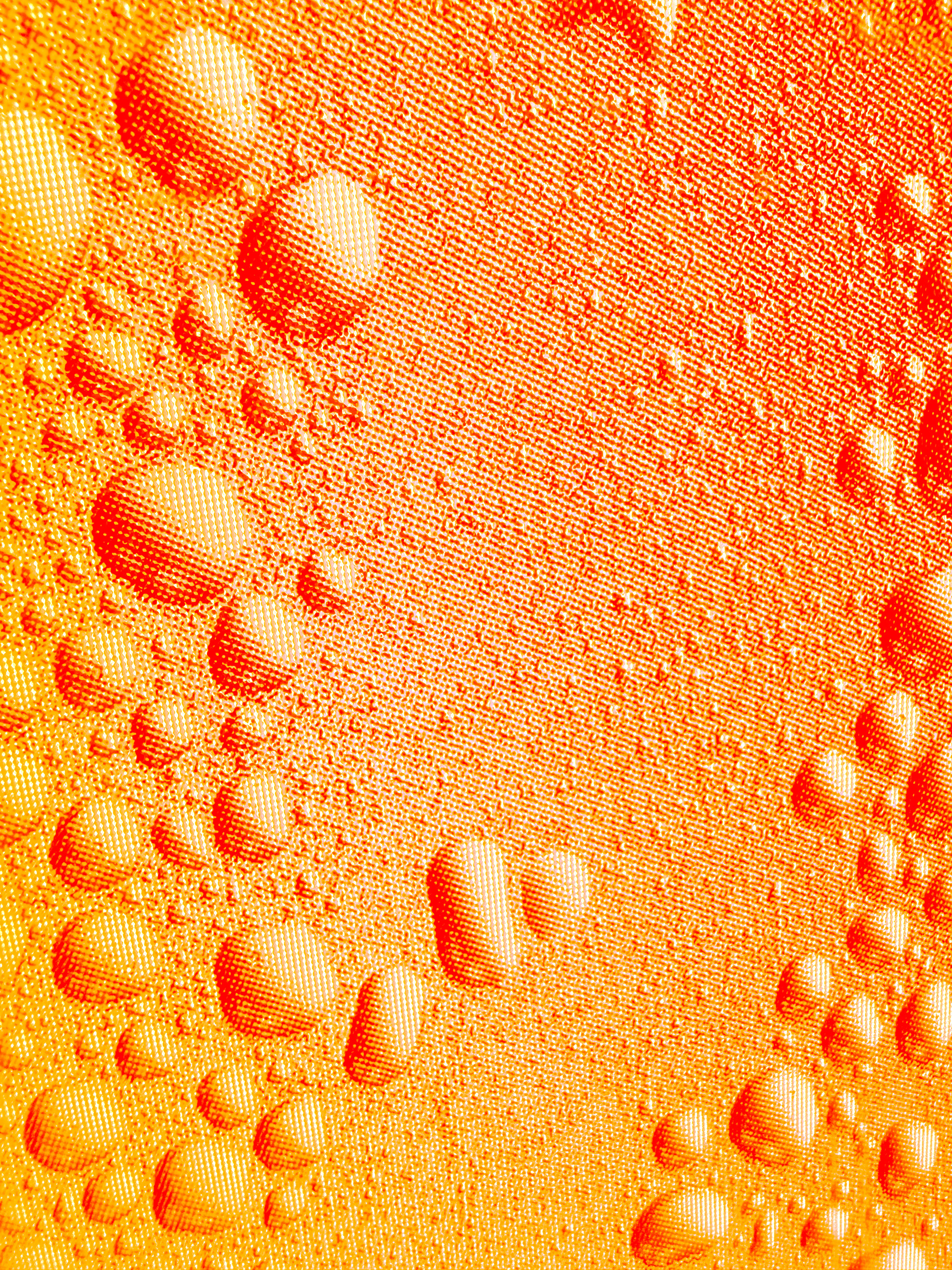
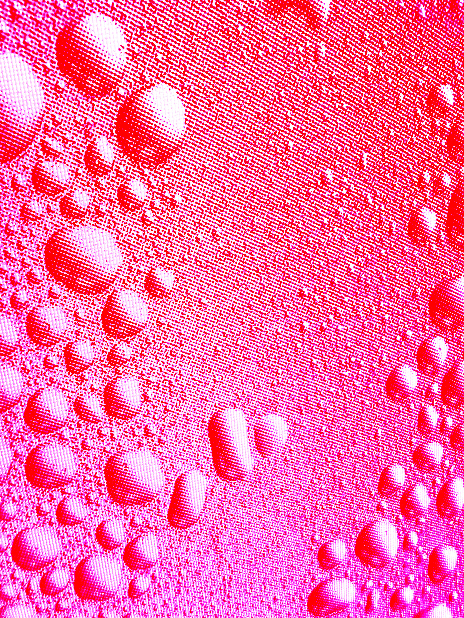
I used a photograph I had taken of water droplets on a vending machine. I enhanced the image with color and texture to create a more visually interesting and polished appearance for the cans.
Digital Iterations
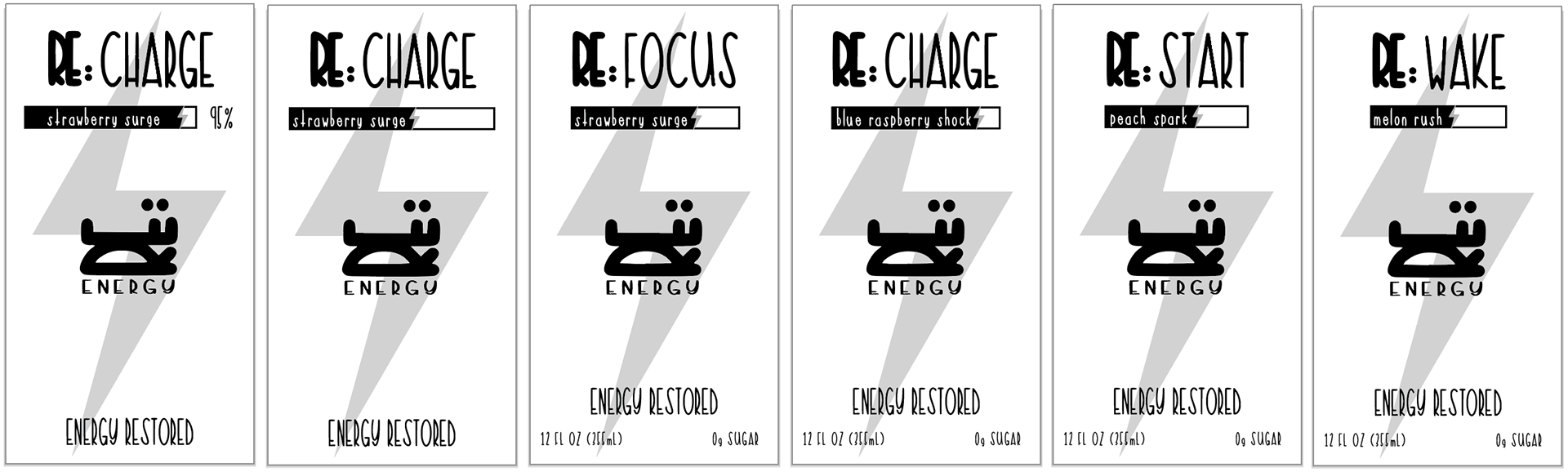
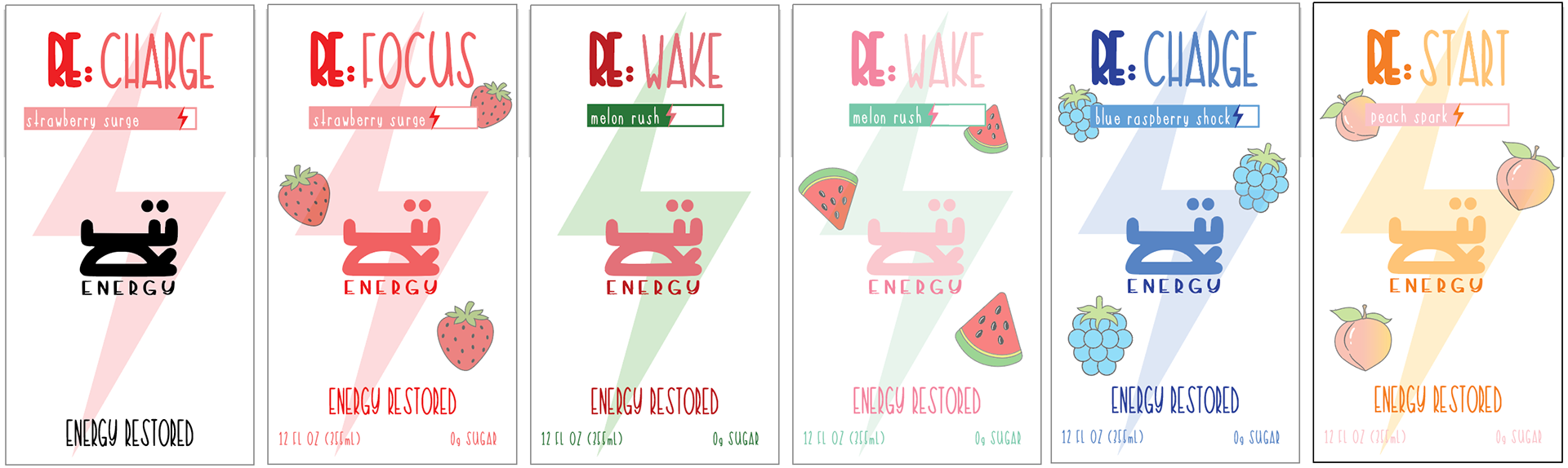
Revised Iterations
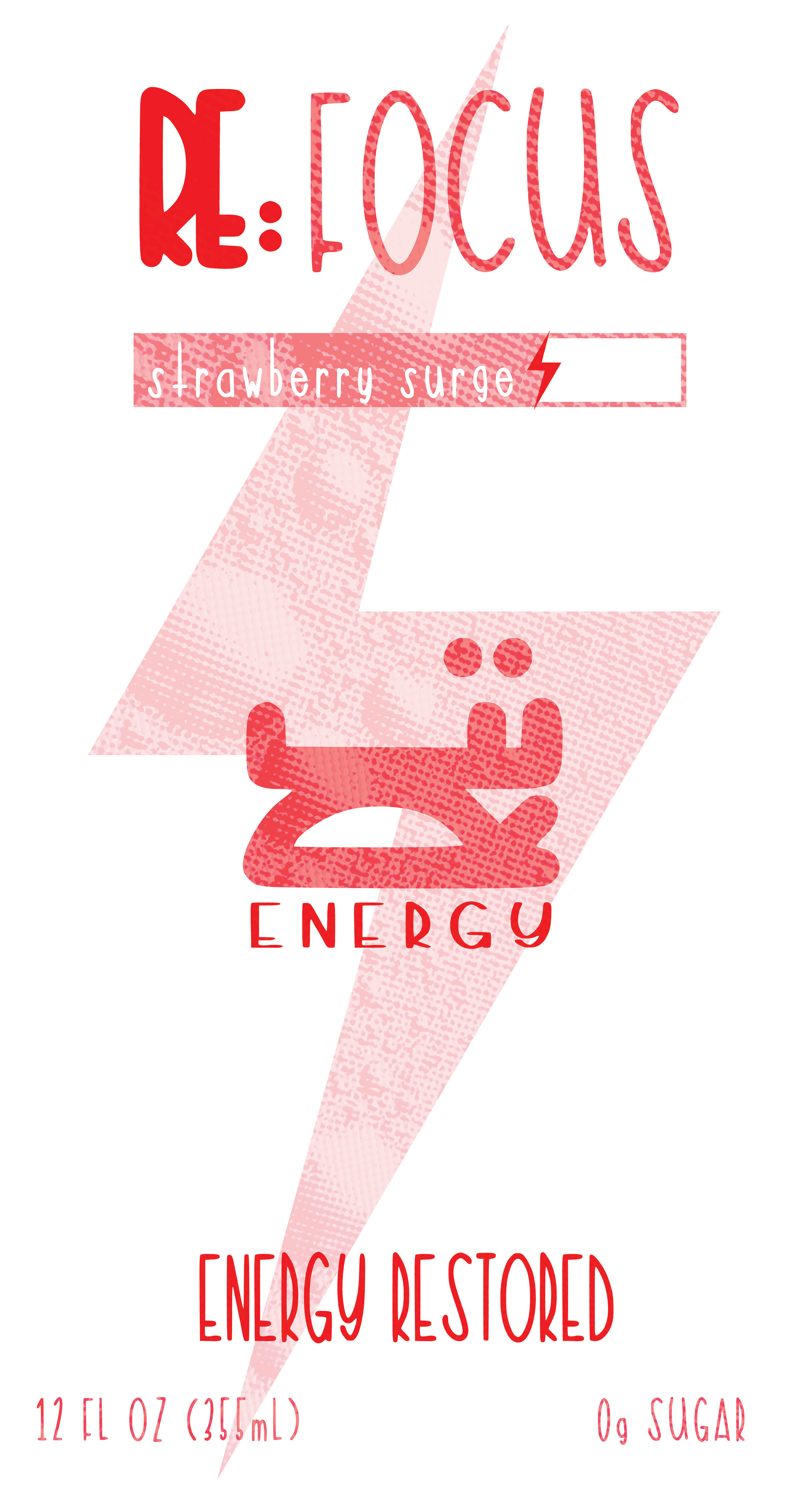
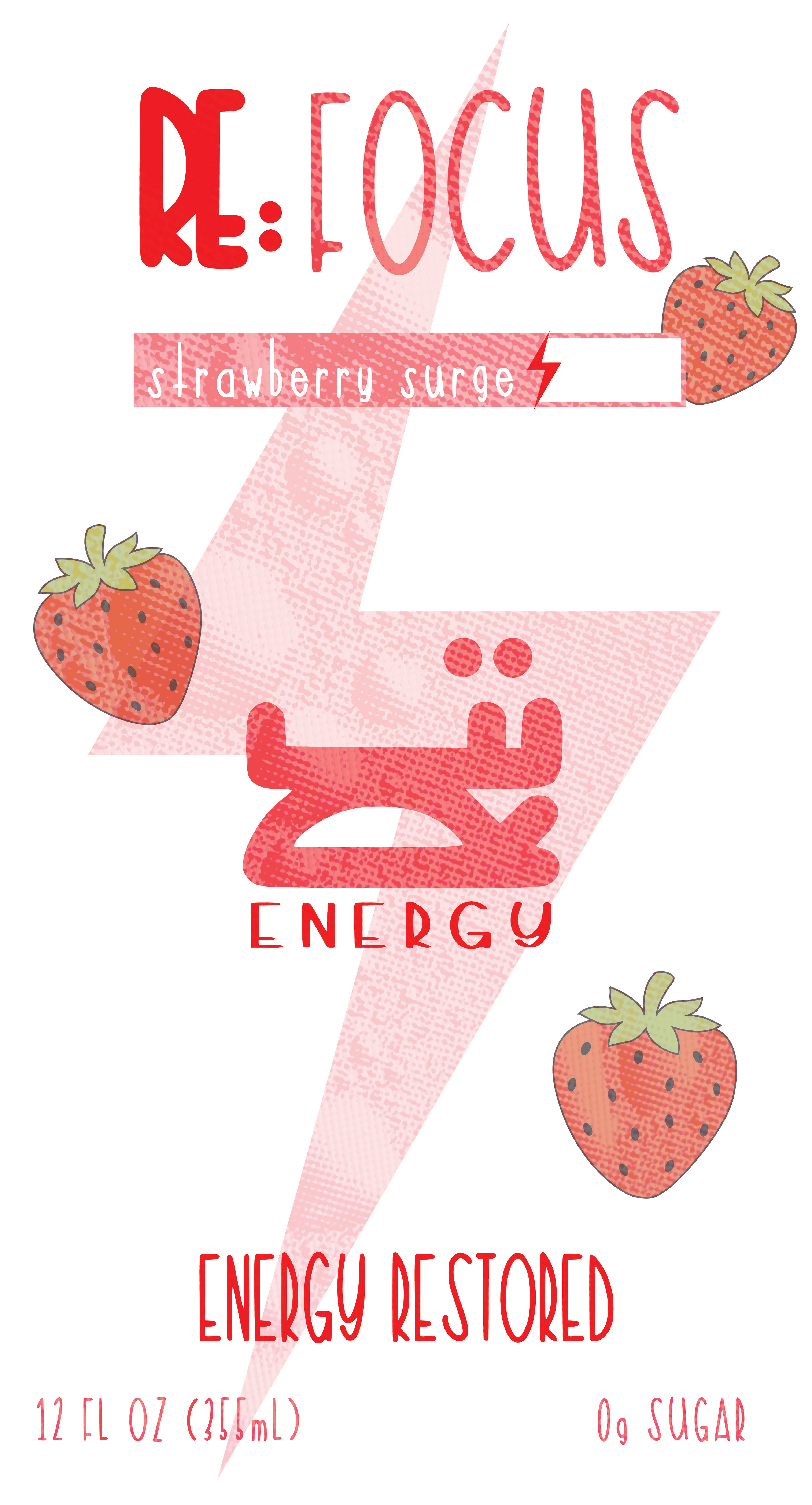
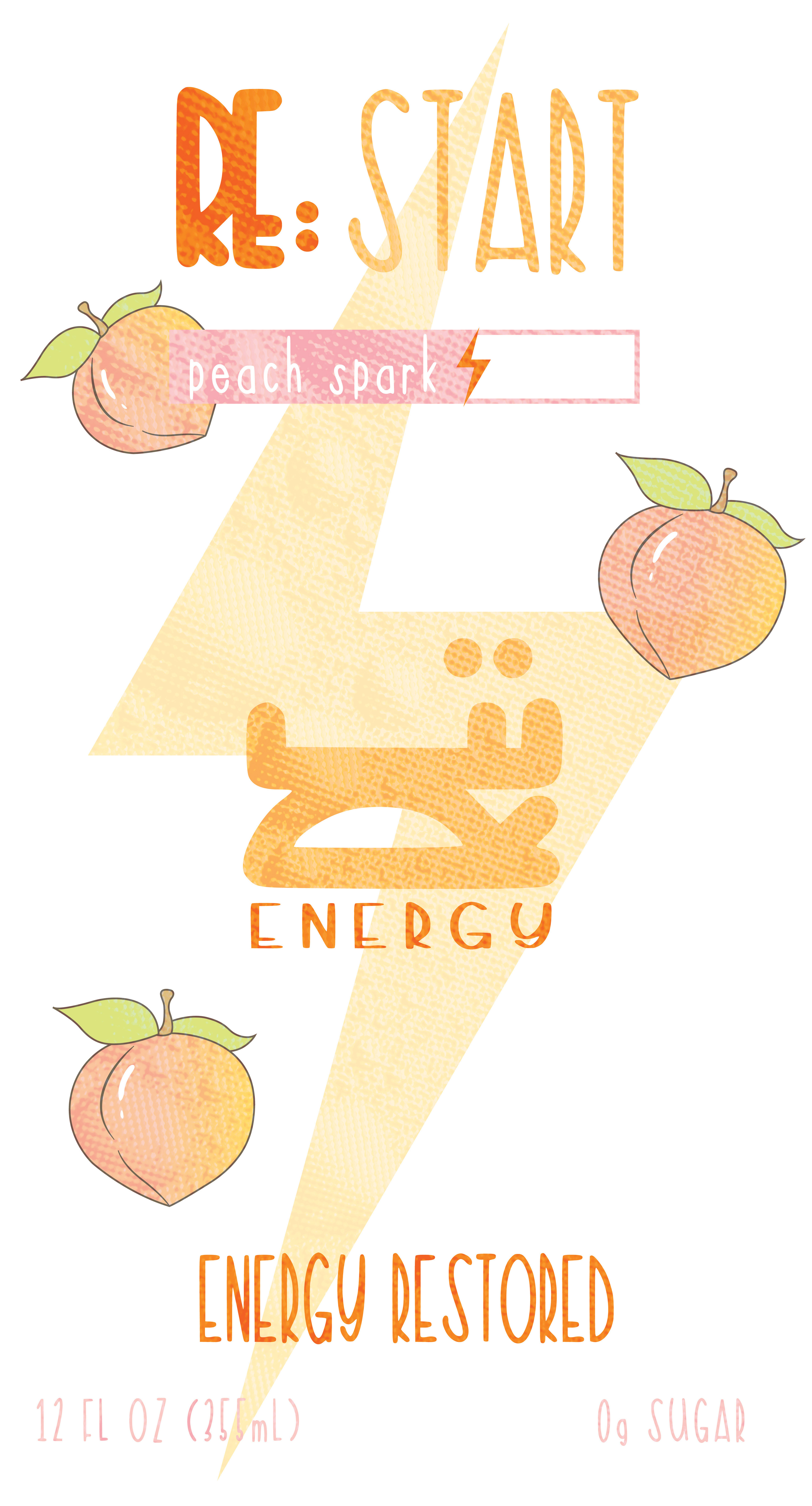
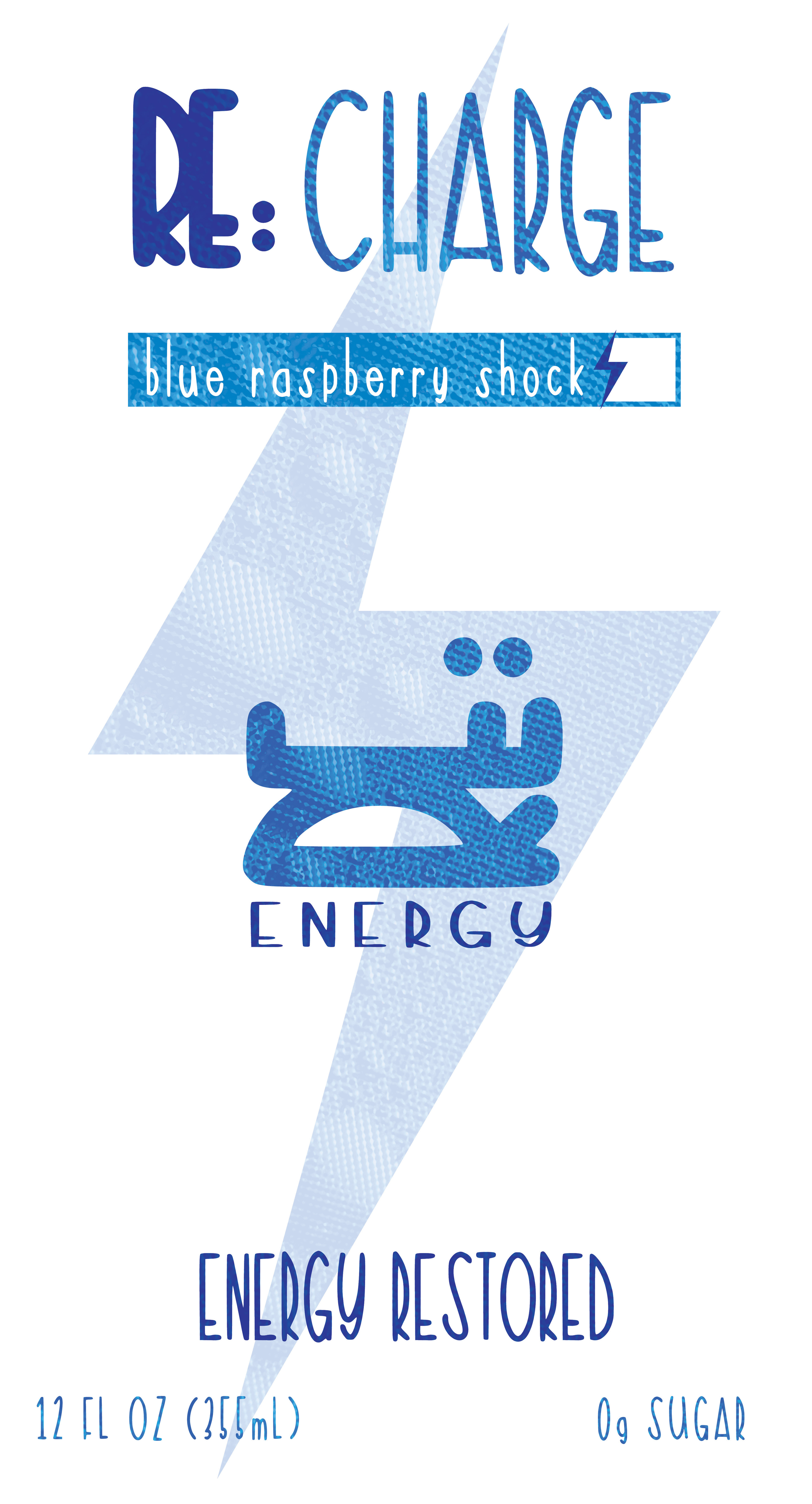
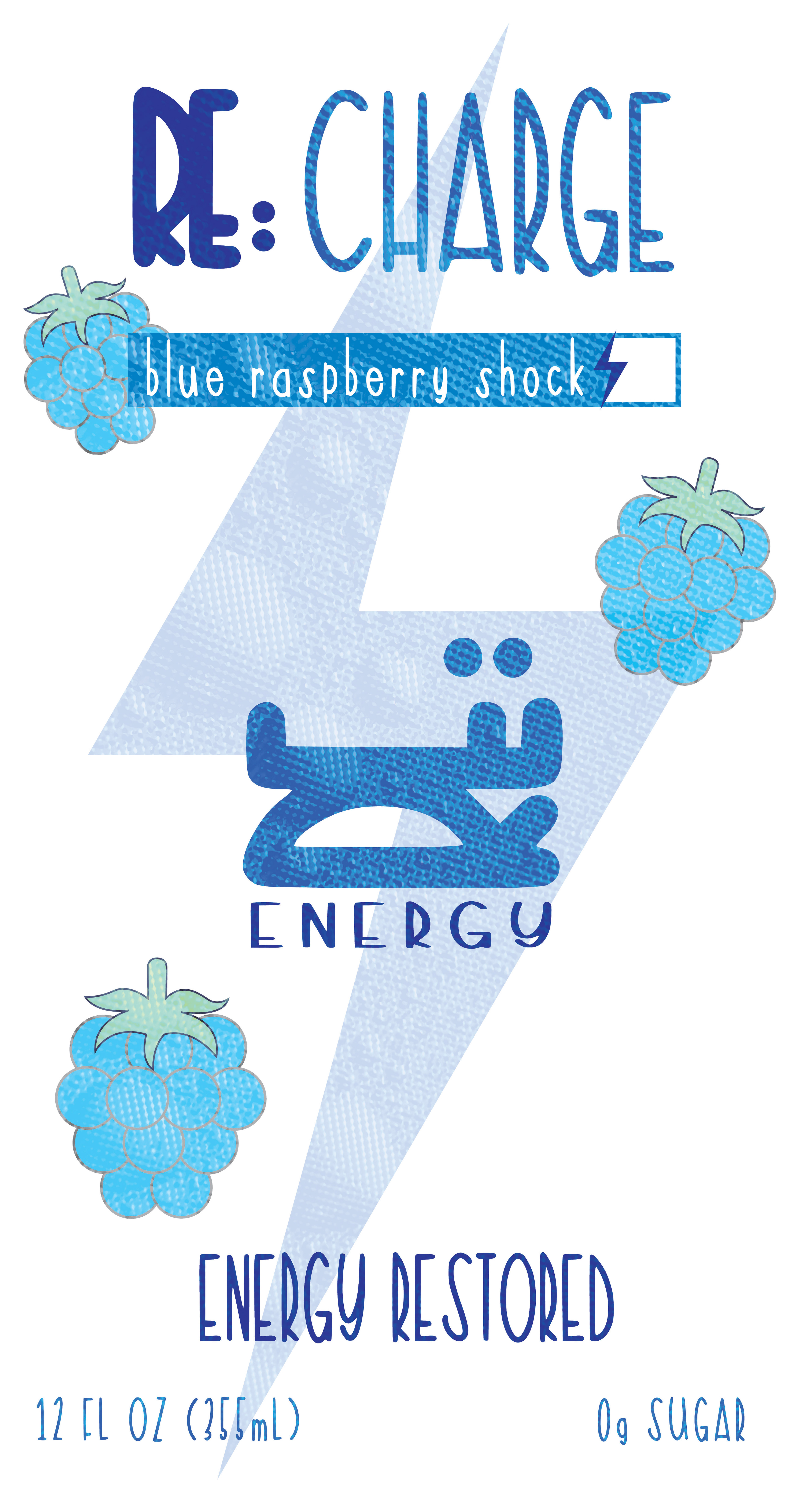
Final Design